How to Create Histograms in Excel for Mac

Excel for Mac finally provides a way to create Histograms the same way the Windows Version does! This post gives a step-by-step tutorial and tips to get most out of the feature.
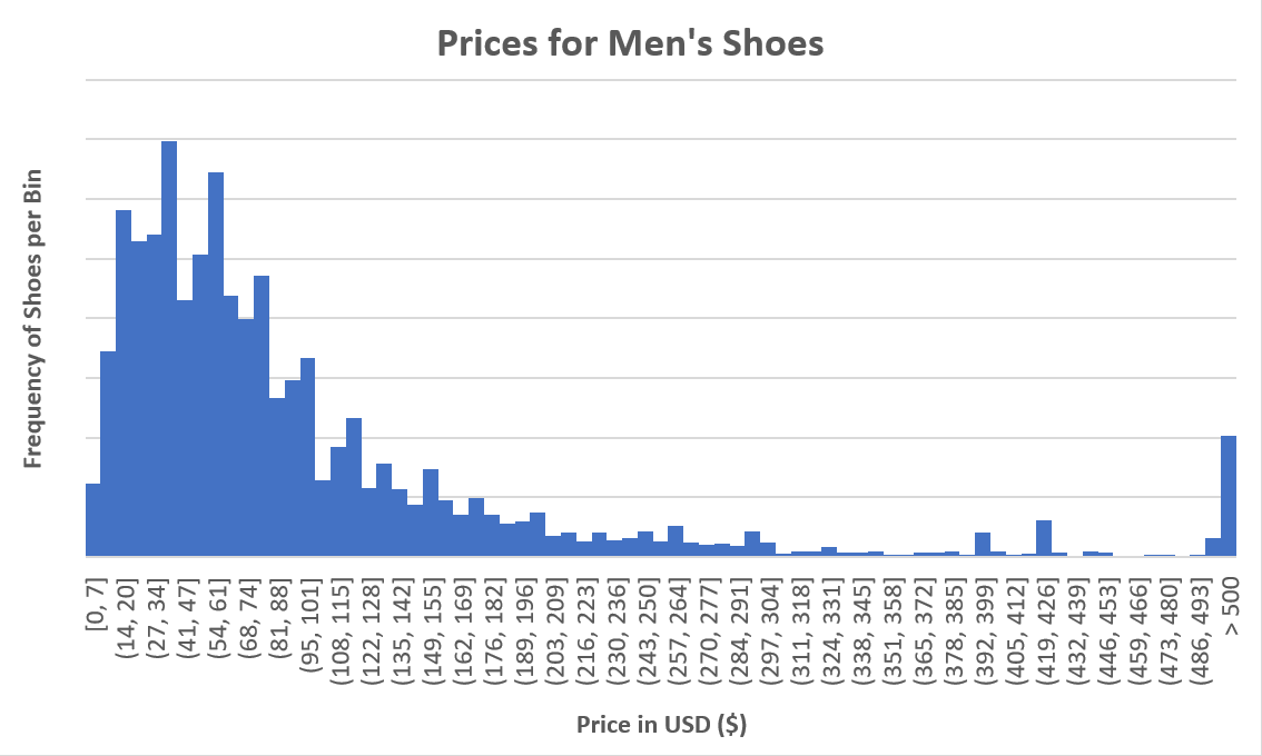
Histogram chart on Mac

Whenever I get my hands on a new data set, I immediately turn to histograms to get myself acquainted with the data. Even with data that I’m familiar with, histograms allow me to quickly find interesting aspects in data attributes. In Excel, it’s best to create a histogram from the values in one column.

What are Histograms?

Histograms almost look like any other column chart. But they have a special purpose. When you are working with numeric data, histograms allow you to show the distribution of this data and identify particular values or data ranges that occur often in the data set, and others that don’t occur at all or very infrequently. A histogram has a few characteristics:

  • The values are shown on the X-axis.
  • The frequency, or the number of times a data range occurs, is shown on the Y-axis.
  • A histogram doesn’t show a column for every value. Instead, it groups values that are close to each other in bins. All bins have the same bin width.

When do you use Histograms?

Histograms are used when you want to better understand your data. To illustrate this, we will be working with this dataset of 10,000 men’s shoes.

Download a simplified version of the data set that is used in this post.

Let’s say you have to research shoe prices of shoes in the US. I downloaded the data set, removed a few columns that I knew I would not need. Column B contains the prices for all men’s shoes of the data set. We can apply some statistical functions to get started. Just calculating the average (AVERAGE(B:B)) gives you 112.37, while the median (MEDIAN(B:B))returns 65.

This is where histograms shine. The two statistical functions above give you one data point, but no context at all. Histograms let you see how the data behaves, whether there are any outliers, and where the most frequent values are.

Histograms in Excel for Mac

The steps to customize histograms in Excel for Mac are slightly different from Windows. The steps below work with Excel for Mac from version 16.21 which was released in January 2019. The app works on both older version of OS X and the more recent macOS.
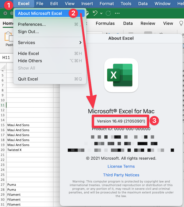
You can find out which version you use by clicking on Excel > About Microsoft Excel
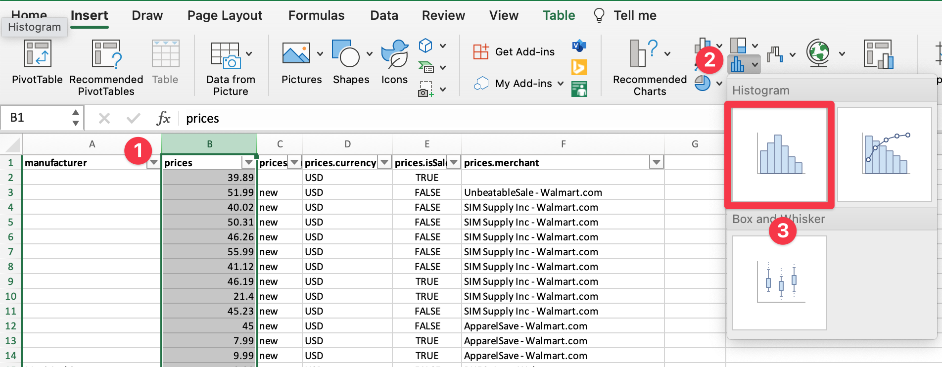
Create Histogram Chart

  1. Select the data you would like to analyze with the histogram
  2. In the “Insert” menu, choose the small histogram chart group icon
  3. Choose the first Histogram chart in that dialog

This will automatically create your histogram showing the distribution of prices from low to high. But this doesn’t look useful yet, does it?

There are a few important steps you should take with every histogram:

Group together outliers

In a normal histogram, bins all have the same width. In our example, some shoes cost more than $16,000. This makes it hard to find patterns in the distribution other than the fact that most shoes cost much less.

In this situation, it is helpful to group together any shoes over, say, $500.
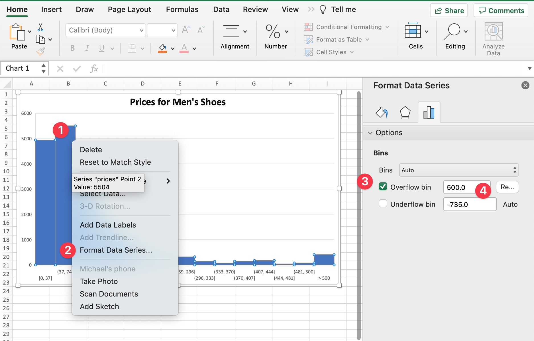
Cut off any values greater than 500

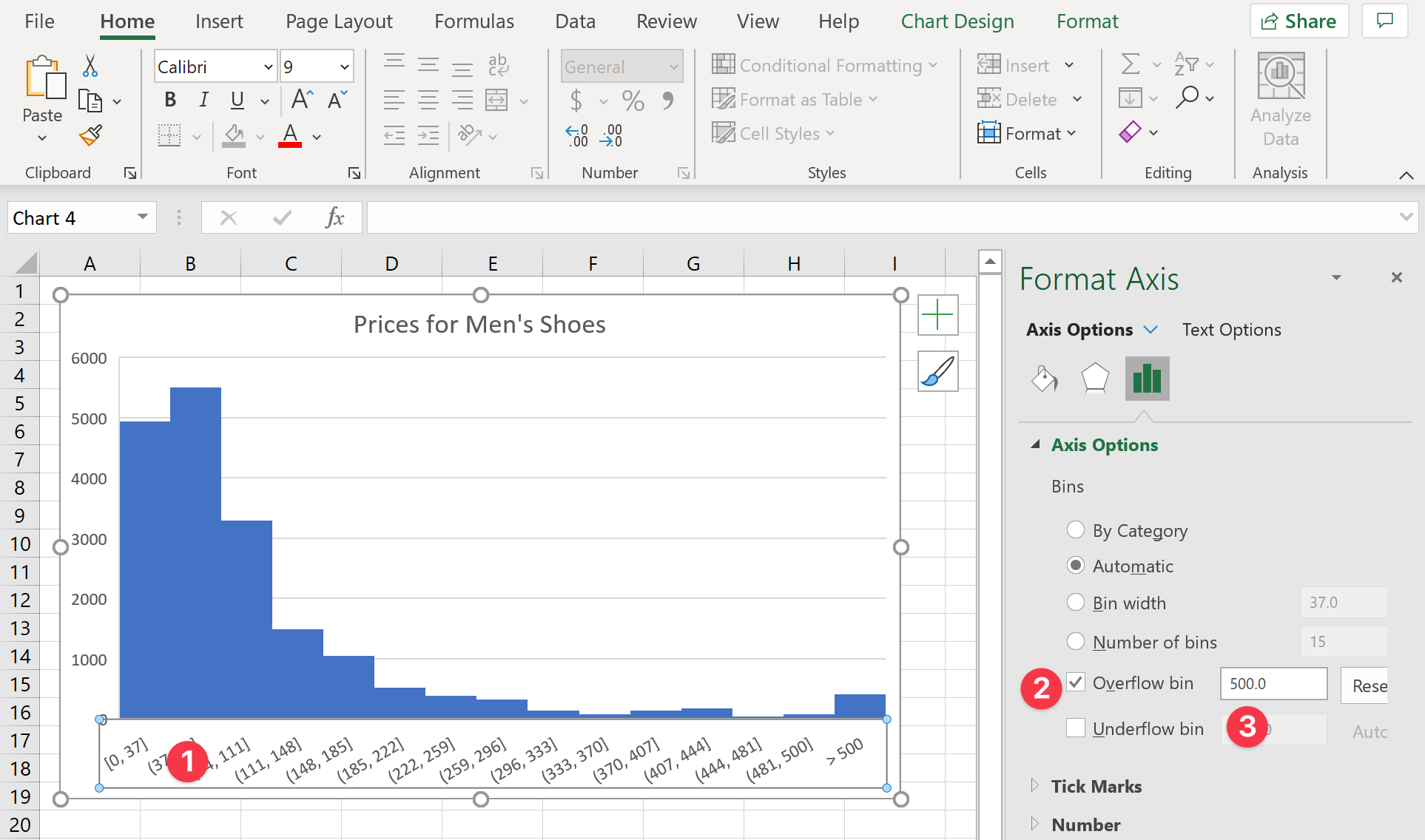
  1. Right-click (or Ctrl + click) one of the bars of the histogram
  2. Select Format Data Series to open the dialog
  3. Check Overflow bin to cut off any outliers
  4. Change the cut-off value to 500.

Now we have a much-improved histogram that allows us to better see the distribution of prices. Of course, feel free to play with this value to see how this changes your histogram.

Select the optimal bin width

Now that our histogram is understandable, we can improve it further. By default, Excel automatically chose the bin width and the number of bins the histogram shows. But the 15 bins might be a bit too coarse. It isn’t particularly helpful yet to know that most shoes are priced between $37 and $74. If we change the number of bins, we get a better idea of how the data is shaped:
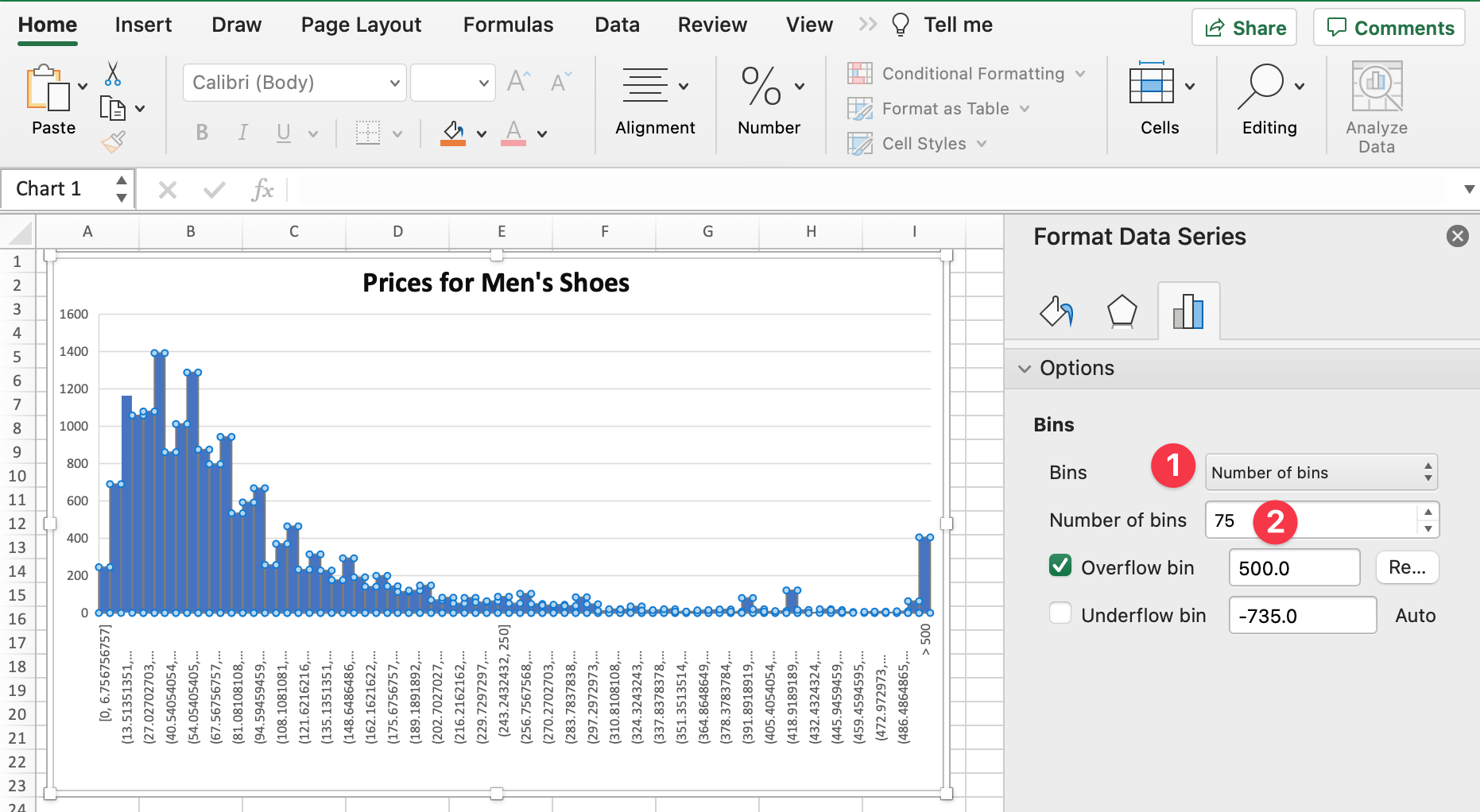
Tweak the number of bins and the bin width

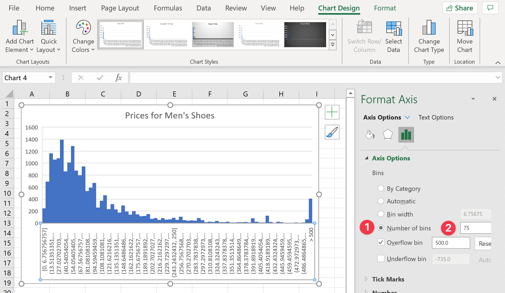
  1. In the same Format Data Series dialog, select Number of bins from the Bins dropdown.
  2. Change the value to 75

Now we can see that this histogram has many smaller peaks. That makes sense, as most shoes are priced at values like $49, $79.90, or 59.99. This is what the chart now shows. With any histogram, it’s best to play around with the bin width or the number of bins and find a setting that shows the overall shape but also any smaller peaks.

Change the number format

Lastly, we want to change the number format of the X-axis so that it’s more easily readable.
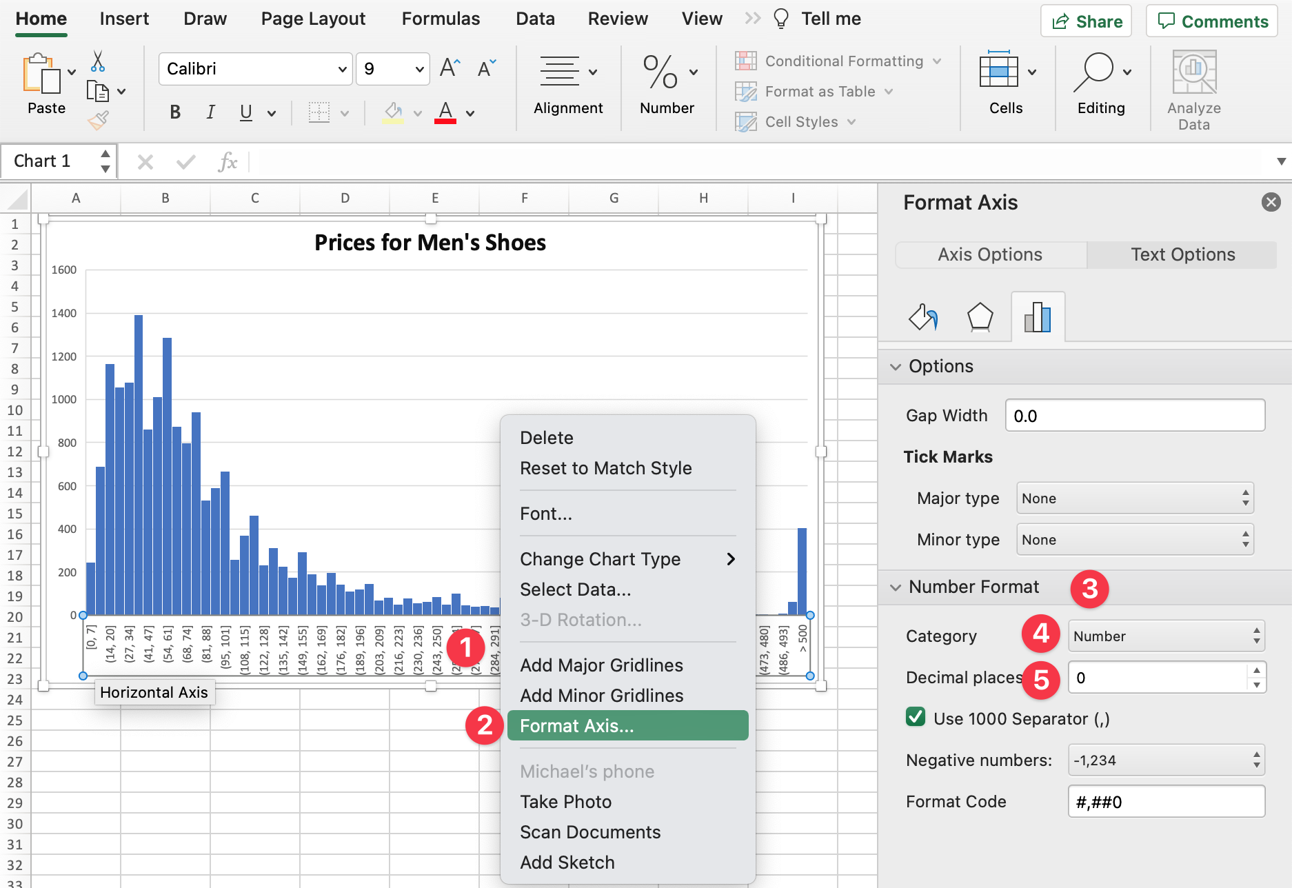
Make the numbers more readable

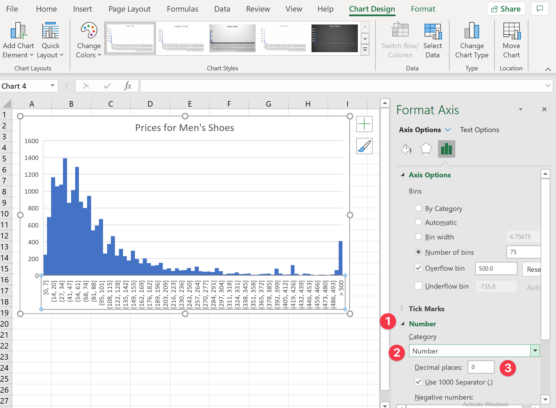
  1. Right click anywhere on the x-Axis
  2. Select Format Axis from the dialog
  3. Go to the section Number Format
  4. Select Number from the Category item
  5. We’re interested in whole numbers only, so let’s set the Decimal places option to 0.

Further Analysis

Once you have a histogram, the analysis process is not finished yet. In fact, you are just getting started. For example, you could compare the price distribution for different brands. To do that, filter your data just just show the shoes for one brand (or Manufacturer, in our case):
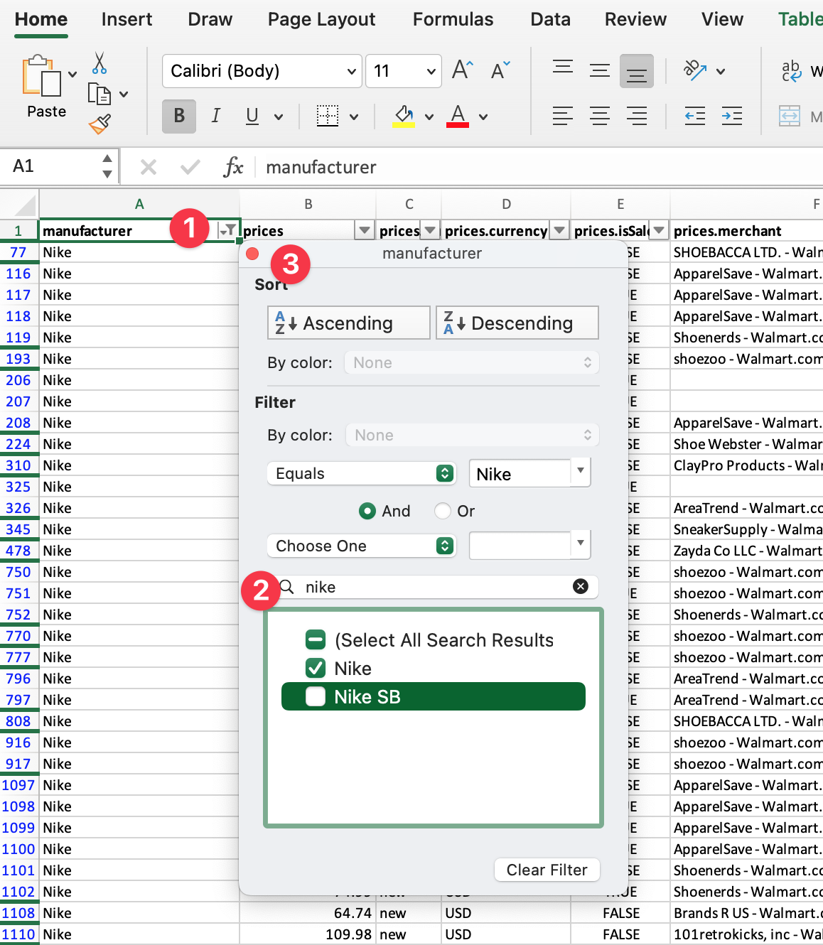
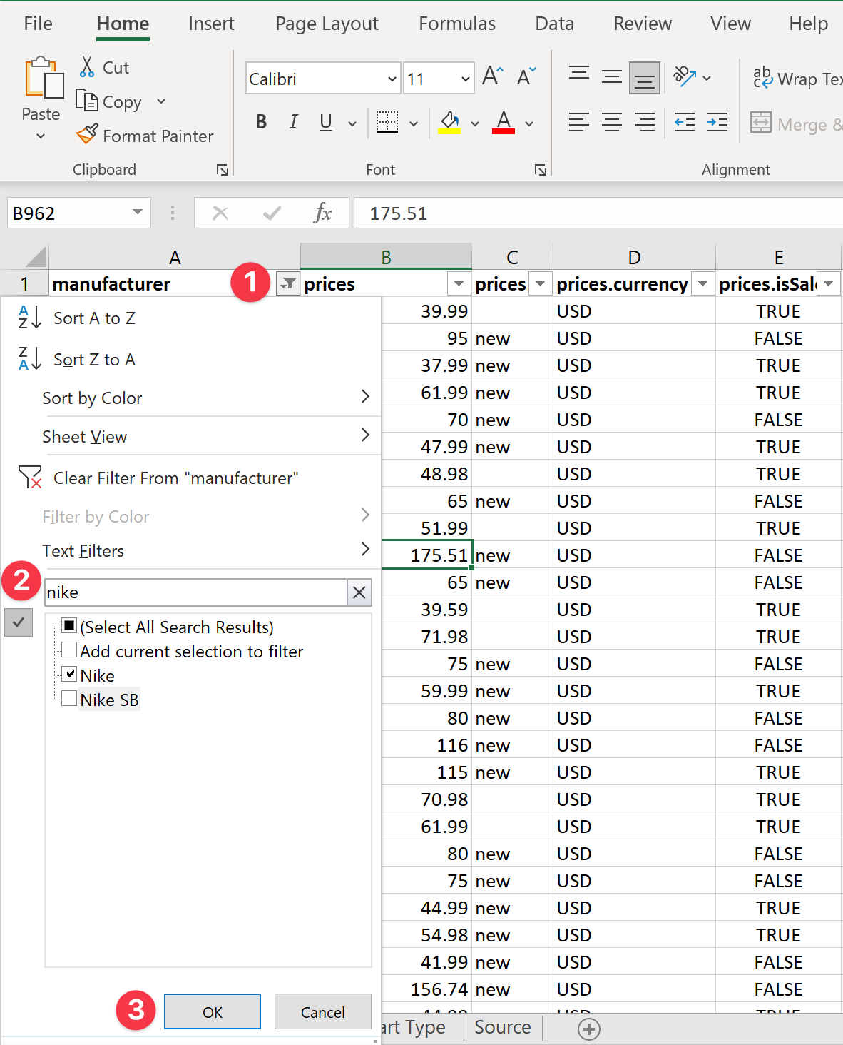
  1. Click the filter icon at the top of the Manufacturer column
  2. Type the brand you’d like to look at (e.g. Nike)
  3. Close the dialog with the red close button at the top left

See how your histogram changes. You might have to go through the steps above to tweak the histogram bins and end up with a useful chart.
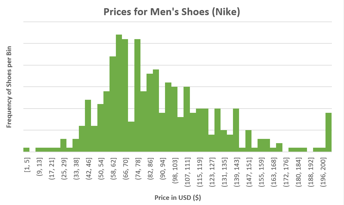
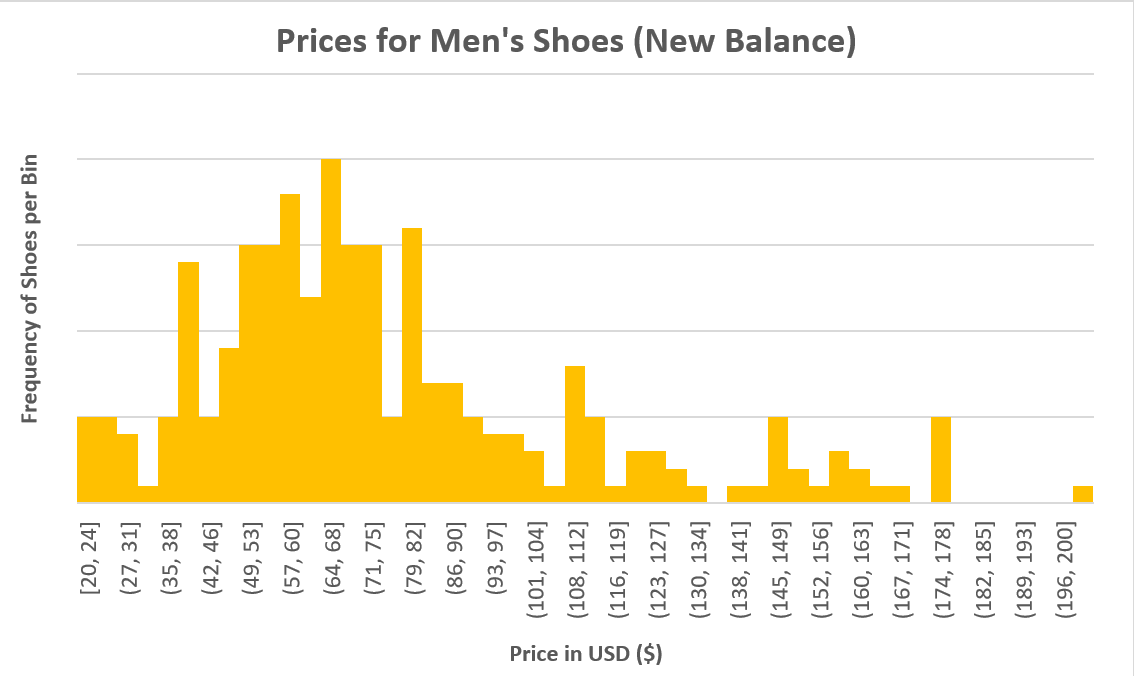
Prices for Nike Prices for New Balance

How to Create Histograms in Excel in Less Than 5 Minutes

Use the built-in chart type to create histograms with Microsoft Excel. This post gives a step-by-step tutorial and tips to get most out of the feature.

Histogram Chart on Windows

Whenever I get my hands on a new data set, I immediately turn to histograms to get myself acquainted with the data. Even with data that I’m familiar with, histograms allow me to quickly find interesting aspects in data attributes. In Excel, it’s best to create a histogram from the values in one column.

What are Histograms?

Histograms almost look like any other column chart. But they have a special purpose. When you are working with numeric data, histograms allow you to show the distribution of this data and identify particular values or data ranges that occur often in the data set, and others that don’t occur at all or very infrequently. A histogram has a few characteristics:

  • The values are shown on the X-axis.
  • The frequency, or the number of times a data range occurs, is shown on the Y-axis.
  • A histogram doesn’t show a column for every value. Instead, it groups values that are close to each other in bins. All bins have the same bin width.

When do you use Histograms?

Histograms are used when you want to better understand your data. To illustrate this, we will be working with this dataset of 10,000 men’s shoes.

Download a simplified version of the data set that is used in this post.

Let’s say you have to research shoe prices of shoes in the US. I downloaded the data set, removed a few columns that I knew I would not need. Column B contains the prices for all men’s shoes of the data set. We can apply some statistical functions to get started. Just calculating the average (AVERAGE(B:B)) gives you 112.37, while the median (MEDIAN(B:B))returns 65.

This is where histograms shine. The two statistical functions above give you one data point, but no context at all. Histograms let you see how the data behaves, whether there are any outliers, and where the most frequent values are.

Histograms in Excel

Note: If you primarily work on Mac OS and use Excel for Mac, the steps to create a histogram are slightly different. Head on over this article to see how to create a histogram on Excel for Mac.

Create Histogram Chart

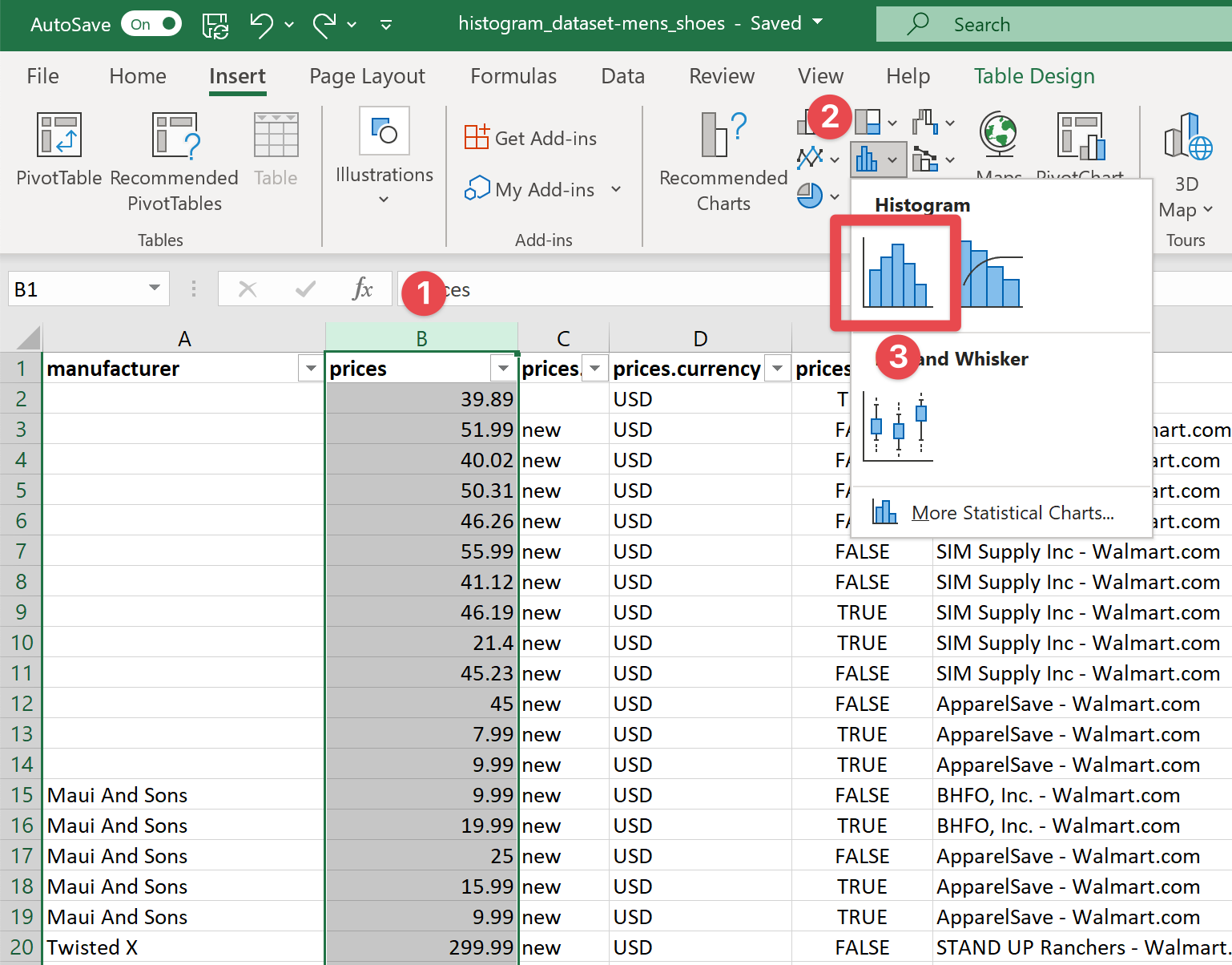
  1. Select the data you would like to analyze with the histogram
  2. In the “Insert” ribbon, choose the small histogram chart group icon
  3. Choose the first Histogram chart in that dialog

This will automatically create your histogram showing the distribution of prices from low to high. But this doesn’t look useful yet, does it?

There are a few important steps you should take with every histogram:

Group together outliers

In a normal histogram, bins all have the same width. In our example, some shoes cost more than $16,000. This makes it hard to find patterns in the distribution other than the fact that most shoes cost much less.

In this situation, it is helpful to group together any shoes over, say, $500.

Cut off any values greater than 500

  1. Double-click the X-Axis to open the Format Axis dialog
  2. Check Overflow Bin to cut off any outliers
  3. Change the cut-off value to 500.

Now we have a much-improved histogram that allows us to better see the distribution of prices. Of course, feel free to play with this value to see how this changes your histogram.

Select the optimal bin width

Now that our histogram is understandable, we can improve it further. By default, Excel automatically chose the bin width and the number of bins the histogram shows. But the 15 bins might be a bit too coarse. It isn’t particularly helpful yet to know that most shoes are priced between $37 and $74. If we change the number of bins, we get a better idea of how the data is shaped:

Tweak the number of bins and the bin width

  1. In the Format Axis dialog, click Number of bins
  2. Change the value to 75

Now we can see that this histogram has many smaller peaks. That makes sense, as most shoes are priced at values like $49, $79.90, or 59.99. This is what the chart now shows. With any histogram, it’s best to play around with the bin width or the number of bins and find a setting that shows the overall shape but also any smaller peaks.

Change the number format

Lastly, we want to change the number format of the X-axis so that it’s more easily readable.

Make the numbers more readable

  1. Expand the Number section of the Format Axis dialog
  2. Choose category Number
  3. We’re interested in whole numbers only, so let’s set the Decimal places option to 0.

Further Analysis

Once you have a histogram, the analysis process is not finished yet. In fact, you are just getting started. For example, you could compare the price distribution for different brands. To do that, filter your data just just show the shoes for one brand (or Manufacturer, in our case):

Filter for one shoe brand

  1. Click the filter icon at the top of the Manufacturer column
  2. Type the brand you’d like to look at (e.g. Nike)
  3. Click OK

See how your histogram changes. You might have to go through the steps above to tweak the histogram bins and end up with a useful chart.
Prices for Nike Prices for New Balance

Introduction

You work with data but aren’t a data scientist? You want to get better at preparing, analyzing, and visualizing data in your day-to-day job? Then this site is for you.